The psychology of colour in office design and furniture
In today's fast-paced and competitive business world, creating an inviting and productive workspace is more important than ever. One often overlooked aspect of office design is the role of colour psychology. The colours you choose for your office furniture and environment can significantly impact the mood, productivity, and overall atmosphere of your workspace.
The impact of colour
Colour has a major influence on our emotions and behaviour, it can affect our mood, concentration, and even our physical well-being. For many businesses, understanding colour psychology is a key consideration when designing an office interior and selecting office furniture. Here are a few thoughts on how different colours can impact your office environment.
Blue for focus and calm

Blue is a popular choice for office settings due to its calming and focusing effects. Light blues can promote a sense of tranquility and clarity, making it an excellent choice for spaces where concentration is key, such as booths and pods, conference rooms and individual workstations. Darker blues can convey professionalism and confidence, making them suitable for executive offices.
Green for Creativity and Balance

Green is associated with growth, balance, and harmony. It's a great choice for offices where creativity and innovation are important. Incorporating green into your environment can inspire fresh ideas and a sense of well-being. Consider adding some plants or a living wall to bring the benefits of greenery into your workspace.
Yellow for optimism and positivity

Yellow is a cheerful and optimistic colour that can enhance feelings of positivity and happiness. It's a great choice for common areas or spaces where collaboration and communication are encouraged. Yellow accents, such as chairs, throw pillows or artwork, can add a vibrant touch to your office.
Red and orange for energy and passion

Red and orange are bold and energetic colours that can stimulate excitement and passion. It's often used in small doses to create a sense of urgency or to draw attention. However, too many bold colours can be overwhelming, so use them sparingly in accents or accessories to add a dynamic touch to your office environment.
Neutral Colours for Versatility

Neutral colours like gray, beige, and white provide a versatile backdrop for any office design. They create a clean, professional look and allow you to incorporate pops of colour through furniture, artwork, or accessories. Neutrals can also help balance more vibrant hues and prevent your office from feeling too overwhelming.
Putting Colour Psychology into Practice
To put colour psychology into practice when choosing office furniture and designing your environment:

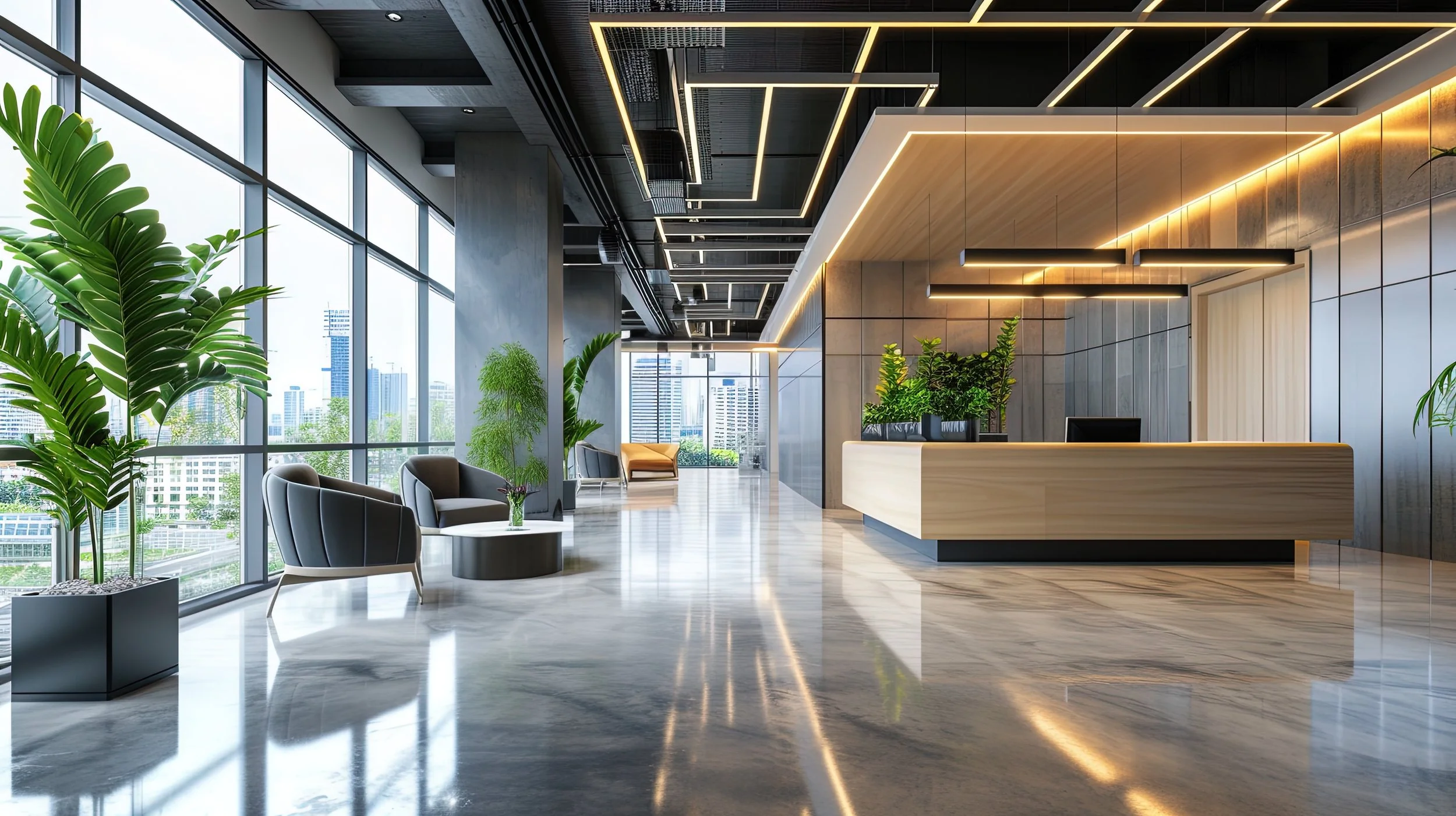
An example 3D render which helps to visualise the use of design and colour.
Identify the Purpose: Consider the primary function of each office space and choose colours that align with its purpose. For example, soothing blues for a quiet workspace and energising colour accents in a creative or collaborative area.
Consider Your Brand: Incorporate your brand colours into the office design to reinforce your company's identity and values.
Balance and Contrast: Use a combination of colours to create balance and contrast in your office design. This can make the workspace more visually appealing and functional.
Consult a Designer: If you're unsure about which colours to choose, talk to one of our interior experts who specialise in workspaces. They can provide expert guidance and also help bring designs and ideas to life using our in-house interior design and 3D rendering service.